Post by Chris Aniszczyk
In August we shared both CNCF’s project velocity as well as the top 30 highest open source projects in 2020. Our goal is to share this information every six months moving forward. Providing insight into the projects with the highest developer velocity give a good indication into which areas are taking off and which platforms are likely to be successful in the coming months and years.
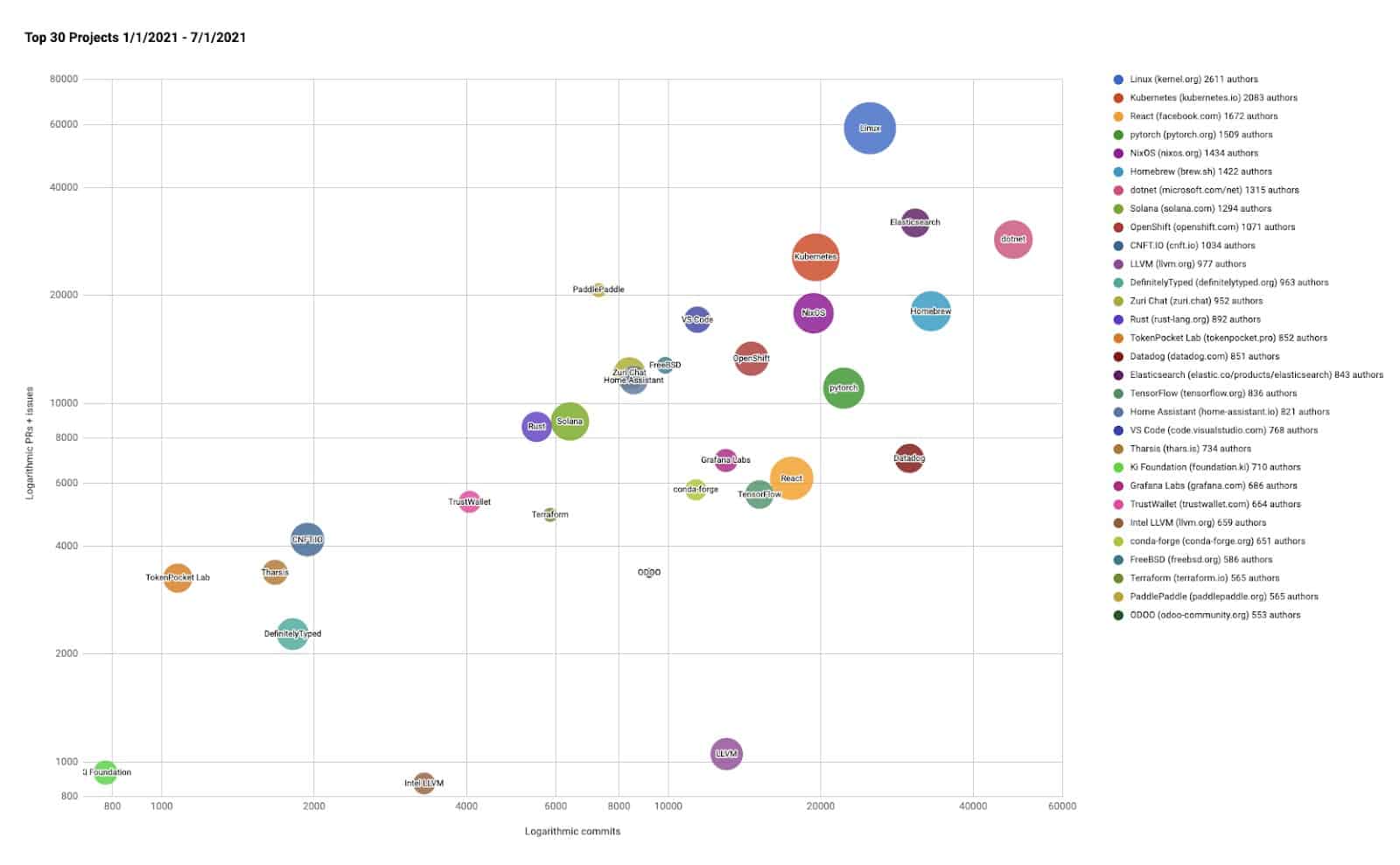
Note that: Rather than debate whether to measure them via commits, authors, or comments and pull requests, we use bubble charts to show all three axes of data, and plot on a log-log chart to show the data across large scales. In the graphs, the bubbles’ area is proportional to the number of authors, the y-axis (height) is the total number of pull requests & issues, and the x-axis is the number of commits.
Here are the main takeaways I see from these charts:
- OpenTelemetry has the second largest contributor community in CNCF (behind Kubernetes) and shows that the interest in modern observability tools and collaboration continues to be important
- The GitOps ecosystem combined has some of the highest velocity projects in CNCF if you combine the Argo and Flux project velocities.
- We also see that projects that focus on developer experience improvements, whether it’s Backstage, Dapr or the GitOps ecosystem, these are projects that continue to grow.
- Envoy continues to have a strong and growing community and has become one of the most widely used data planes across the service mesh ecosystem
CNCF projects – Last 6 months (interactive chart)
CNCF projects – 2021 (interactive chart)
Top Open Source projects for the last 6 months (interactive chart)

You can find all the current and past reports on GitHub, as well as a list and charts on the Google sheets below:
- All CNCF Projects for 2021
- All CNCF Projects for the second half of 2021
- Top 30 Open Source projects for 2021
All of the scripts used to generate this data are at https://github.com/cncf/velocity (under an Apache 2.0 license). If you see any errors, please open an issue there.