Staff post by Chris Aniszczyk
Date/Time: July 11 at 8am
For the last several years we have tracked open source project velocity, which has enabled us to monitor the trends and technologies that resonate with developers and end users. For comparison, have a look at past timeframes from our blogs.
Here are the main takeaways I see from these charts:
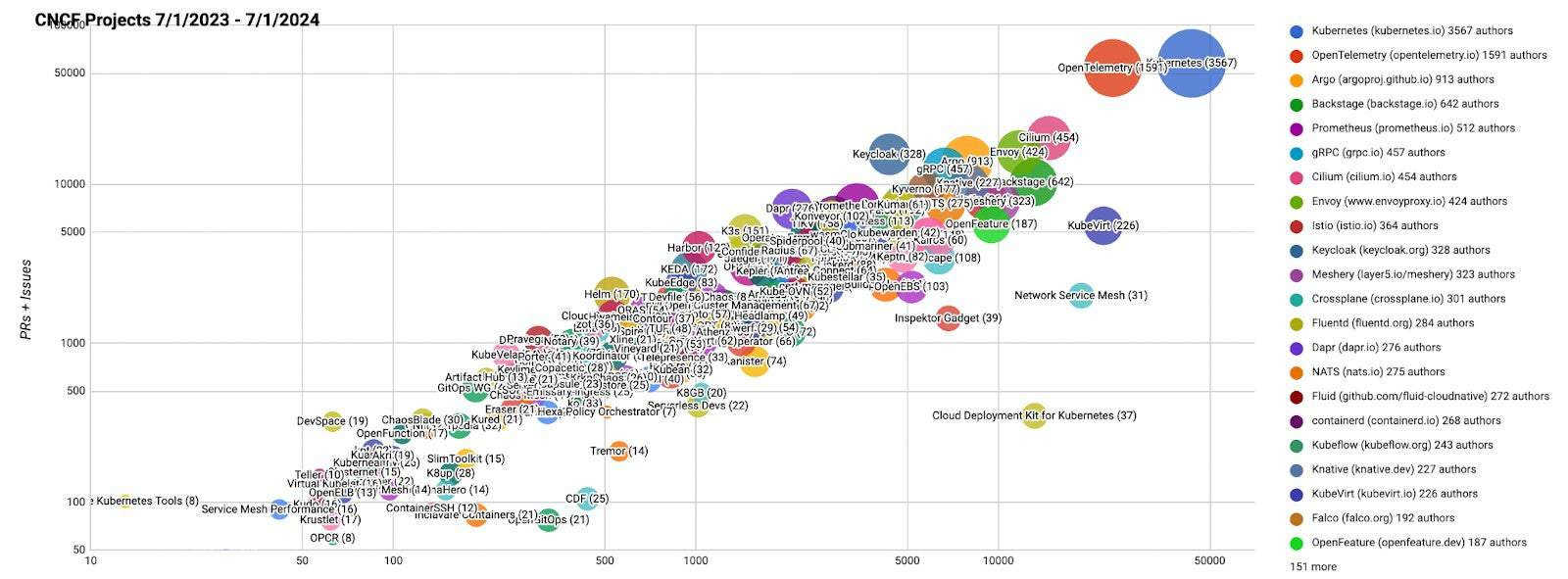
- Kubernetes continues to mature with its consistent and largest contributor base
- OpenTelemetry continues to grow its contributor base and remains the second highest velocity project; they recently added profiling as a new signal type
- Backstage grows solving an important pain point around developer experience
- GitOps continues to be important in the cloud native ecosystem, where projects like Argo and Flux continue to cultivate large communities
- Crossplane grew its contributor base by over 20% in the last year reflecting a desire for open source control planes in the era of open source relicensing issues
- KeyCloak joined CNCF last year as an incubating project and has a large community pushing open source identity and access management forward
- In many cases, CNCF projects underpin large scale AI infrastructure and we have Kubeflow appearing on the top 30 CNCF project list for the first time in 2023.
CNCF projects – Last 12 months (interactive map)
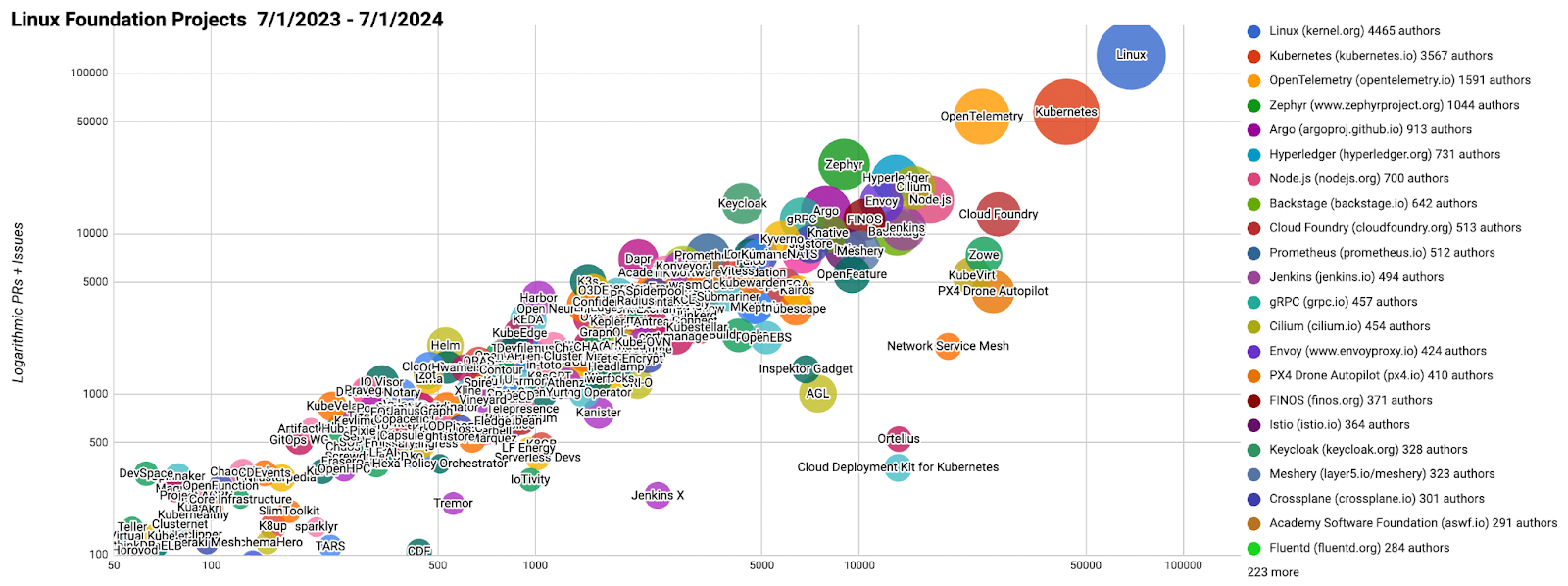
Linux Foundation Projects – Last 12 months (interactive map)
Top 30 open source projects – Last 12 months (interactive map)
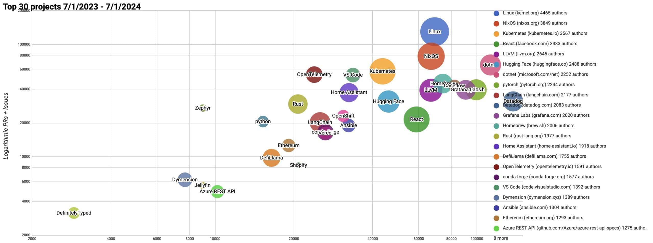
NOTE: We use bubble charts to show three axes of data: commits, authors, and comments/pull requests, and plot on a log-log chart to show the data across large scales.
- The bubble’s area is proportional to the number of authors
- The y-axis is the total number of pull requests and issues
- The x-axis is the number of commits
All of the the current and past reports are available on GitHub, as well as a list and charts on the Google sheets below:
- All CNCF projects for July 2023-July 2024
- All Linux Foundation projects for July 2023-July 2024
- Top 30 open source projects for July 2023-July 2024
All of the scripts used to generate this data are at https://github.com/cncf/velocity (under an Apache 2.0 license). If you see any errors, please open an issue there.
Past blog posts about project velocity:
- A look back at CNCF, Linux Foundation, and top 30 open source project velocity in 2023
- October 2023: where we are with velocity of CNCF, LF, and top 30 open source projects
- A look at the 2022 velocity of CNCF, Linux Foundation, and top 30 open source projects
- Mid-year update on 2022 CNCF, Linux Foundation, and open source velocity
- End of year update on CNCF and open source velocity in 2021
- Update on CNCF and Open Source Project Velocity 2020
- The 30 highest velocity open source projects